
Background
The website of Hylte equestrian association was described as neglected, difficult to maintain, perceived as unprofessional, and unattractive with difficulties for users to find information. By conducting user research focusing on the customer journeys and identifying user painpoints and needs, the informational structure and website navigation got iterated together with the websites overall aesthetics. The implementation of the new CMS system streamlines administrative tasks, resulting in increased efficiency. This transition aims to meet the needs of our target audience by delivering timely and informative content.
| Project group | Company | Project duration |
|---|---|---|
| 6 people | Hylte equestrian association | 6 weeks |
Understanding
Working woth no-profit
When trying to get a better understanding of the problem area we wanted to learn more about the client, the current website, and the structure of non-profit associations. The brief described the current website as hard to maintain, messy and unattractive. We wanted to get a better understanding of why it was experienced this way.
Desktop research
Our exploration kicked off with extensive desktop research, scouring through existing literature, case studies, and industry reports. This phase equipped us with a foundational understanding of the broader landscape of non-profit website management, shedding light on prevalent challenges and best practices.It came to our knowledge that multiple factors are needed to be taken into consideration when working with a non-profit association:
- regulations concerning financiation
- people have other main activities in their lives
- everything is dependent on people's will to spend their free time on the association
User interviews
To glean firsthand perspectives and rich qualitative insights, we conducted semi-structured interviews with a diverse cross-section of users, including board members, volunteers, and regular members of the association. These interviews were thoughtfully designed by me and my colleagues to encourage open-ended discussions, allowing participants to articulate their experiences, frustrations, and aspirations regarding the current website.
Board members: Engaging in candid conversations with board members unearthed valuable insights into the operational constraints and decision-making dynamics governing website maintenance. Regulatory considerations surrounding financing emerged as a prominent theme, shaping the association's approach to allocating resources and prioritizing website updates.
Volunteers and members: Through interactions with volunteers and regular members, we gained deeper insights into the practical challenges encountered while navigating the existing website. The interviews revealed a prevailing preference within the regular members and volunteers for utilizing Facebook groups as their primary source of information exchange within the association. This preference stemmed from the perceived ease of use, real-time updates, and interactive nature of Facebook groups, which fostered a sense of community engagement and immediacy that was lacking in the association's website. Despite the association's efforts to maintain an informative website, our interviews unveiled a stark reality: a significant portion of regular members and volunteers exhibited minimal engagement with the website, citing usability issues, outdated content, and a cumbersome navigation experience as deterrents to usage.
Relevance of content: Another key finding from our interviews was the pivotal role of content relevance in driving user engagement. Participants expressed a preference for content that was tailored to their specific interests, such as event updates, volunteer opportunities, and community-driven initiatives. The lack of relevant content on the website contributed to a sense of disconnection and disinterest among users, further reinforcing their reliance on Facebook groups for timely and pertinent information.
Need for something new
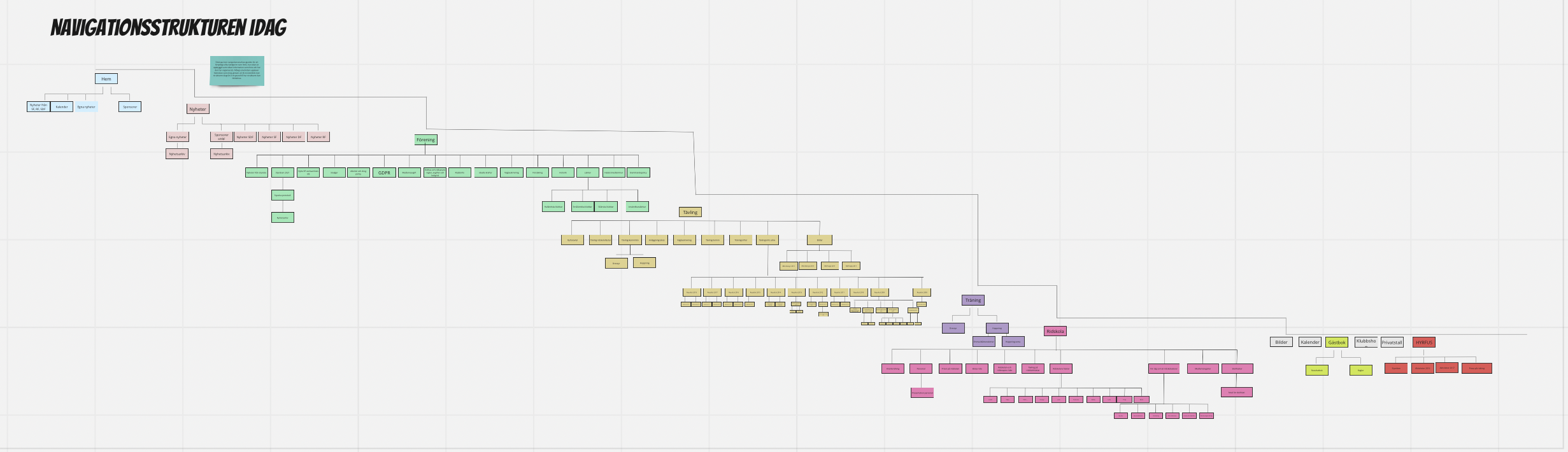
I conducted a walkthrough of the old website to test the information structure that was described as messy during the user-interviews. During the walkthrough i mapped the whole information structure of the website, and we found that the website contained so many navigational levels. To present the findings of the walkthrough we decided to use a sitemap as a tool. The sitemap was presented for the board and while showing the sitemap the clients didn't recognize the information, as the information was published before their time in the association. The website contained information that went several years back which the members in the board didn't know of. This led us to focus on the information structure of the website.
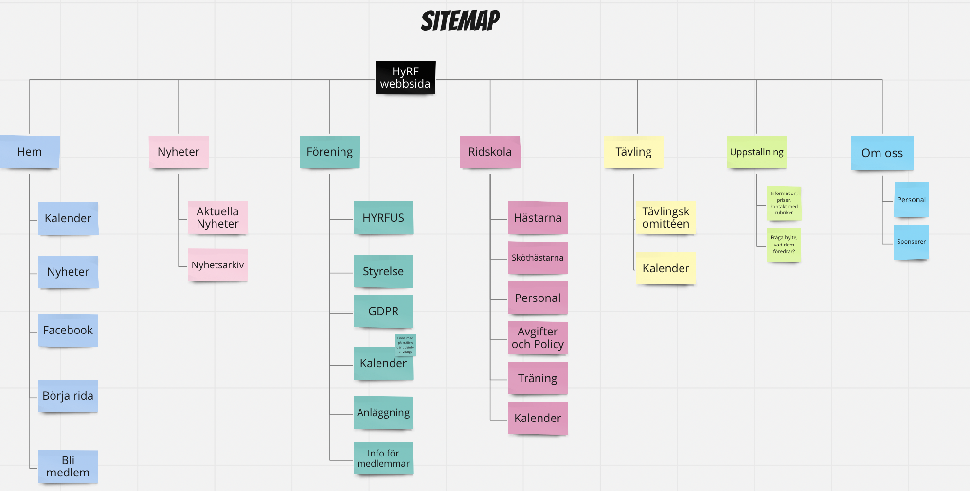
Making sense of things
Working closely with board members, I helped restructure the website's information architecture, focusing on a simpler, more intuitive design. The iterated structure became fundamental for the design concept.
Defining the concept
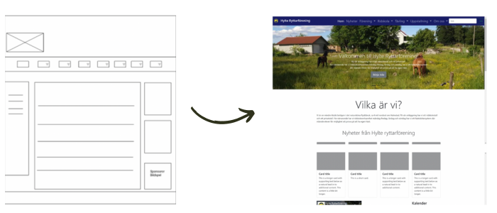
We created a low fidelity prototype for user-testing the informational structure. The evaluations showed that the strucutre was percieved more intuitive than before. After the evaluations we looked into the possibilities of redesigning the website in the current CMS. We concluded that the wishes of the board and the members of the association in terms of the aesthetics of the webpage wouldn't be possible.
A major challenge for the design team was that the CMS only allowed control over the information structure and not over the layout or other visual elements. We had to reflect on alternative strategies that would fit the client's needs. Therefore we worked on two concepts, one for redesigning the website within the current CMS, and one for a headless version. The board wished for us to keep the focus on the headless solution. We decided to work on the headless website, but chose to work with some integrations toward the old version, so that the clients could keep the requirements for the financiations. We also looked into alternative CMS for the association and presented them to the board.
Evaluation
Based on the low fidelity prototype for testing the information structure, we decided to include visual elements such as images, fonts, and content in the prototype, all according to the graphic manual that we processed during the project.The evaluation of this prototype was done through usability testing with a member of the association. The evaluation showed that the user could complete the tasks without difficulties and that the interface was experienced as simple, aestechially pleasing and professional.
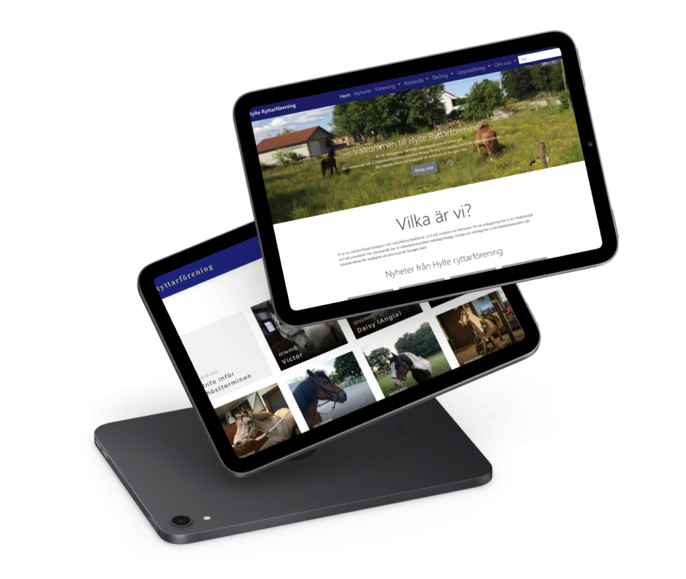
Solution
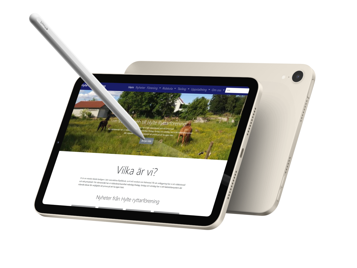
To overcome CMS limitations, we proposed a headless website concept with integrations toward the old version to meet financing requirements. I worked on creating a graphic manual to guide the association in maintaining a consistent brand identity, detailing font usage, logotypes, and color schemes. This manual became an essential tool for future website updates. Ultimately, the redesigned website provided a more professional and user-friendly platform, addressing the initial challenges of the Hylte Equestrian Association's website. The solution aimed to serve riding students, guardians, and other stakeholders within the association who needed timely information.
Contributions
As the Visual Design Lead in our UX team, my primary responsibility was to realize the visual aesthetics and user experience for our digital products. By creating graphic elements, user interfaces, and interaction designs, I worked to ensure that every aspect of our solutions was not only visually appealing but also intuitively navigable and usable for our users. My work also involved collaborating with other team members to ensure that our design maintained high quality and aligned with our business objectives and user needs. Through an iterative design process and open communication, I constantly sought to improve and refine our product to deliver agreat user experience.In Halmstad University's Design Studio projects, the team collaborate on all parts of the project, even though each member has a particular responsibility. I was part of research, ideation, concept, evaluation and UI design.
Lessons learned
Expanded user testing The project utilized usability testing to evaluate the prototype, but expanding the scope and frequency of user testing could have provided more robust feedback. Involving a larger and more diverse group of users in testing sessions, especially those with varying levels of technical proficiency, would have offered a broader perspective on usability and helped identify additional pain points.
Iterative design and flexibility: The iterative design process allowed the team to test and refine concepts, leading to a more user-friendly final product. The use of low-fidelity prototypes for early testing enabled quick feedback and adjustments. This methodology underscored the need for flexibility in design, showing that iterative cycles can help identify and correct usability issues before full-scale implementation.
Constraints as a source of innovation At the beginning of our research, we encountered insights that presented constraints for our concept, which felt quite challenging. I believed that constraints would make it difficult to explore new ideas and find solutions. However, as the project progressed, I discovered that these constraints could be a source of innovation. They encouraged us to think more creatively, focus our efforts, and find clever ways to work within the limitations. Ultimately, I realized that constraints, while challenging at first, can be a driving force for better design and lead to unexpected breakthroughs.