
Research: Identifying Key Challenges
Our mission to improve the navigation began with a deep dive into understanding the issues. We conducted desktop research, a heuristic evaluation, and gathered input from internal stakeholders. The results painted a vivid picture:
- Accessibility barriers were preventing smooth navigation for users relying on keyboards.
- Poor responsiveness meant that menus broke apart or became inaccessible on smaller laptops and mobile devices.
- A confusing hierarchy made it difficult for users to predict where menu items were located.
- Inconsistent visual cues and outdated components further complicated the user experience.
Focus Areas: Charting the Path Forward
With insights in hand, we defined clear priorities to guide the redesign:
- Accessibility First: Enable keyboard navigation and implement a logical tab order.
- Responsive Design: Ensure menus adapted seamlessly to screens of all sizes.
- Streamlined Structure: Simplify and clarify the menu hierarchy to make navigation intuitive.
- Modernization: Update visual components to align with contemporary design standards.
Sketching, Prototyping, and Iterating
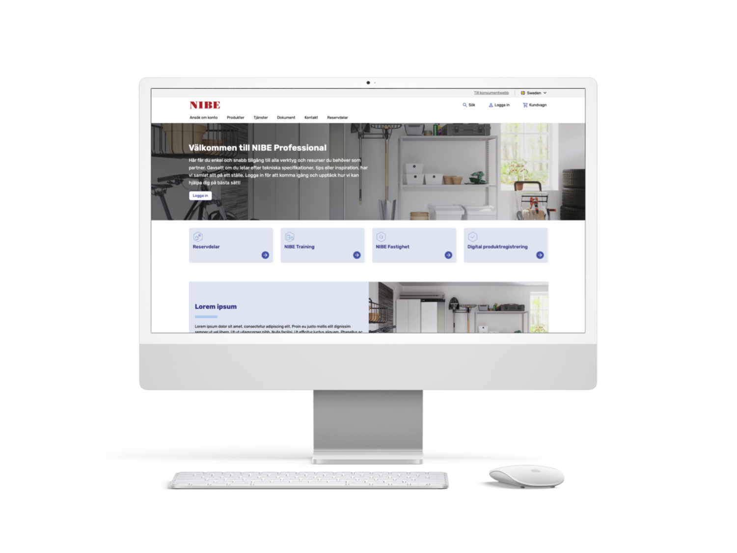
The design process kicked off with low-fidelity sketches, exploring ways to restructure the menu and address pain points. Collaboration was key—stakeholders across teams provided valuable feedback that shaped iterations. High-fidelity prototypes were then developed, incorporating modern design principles and accessibility standards. We also designed breadcrumbs to improve navigation context and revamped the left-hand menu to eliminate redundancies, such as the dual hamburger menus in mobile views.
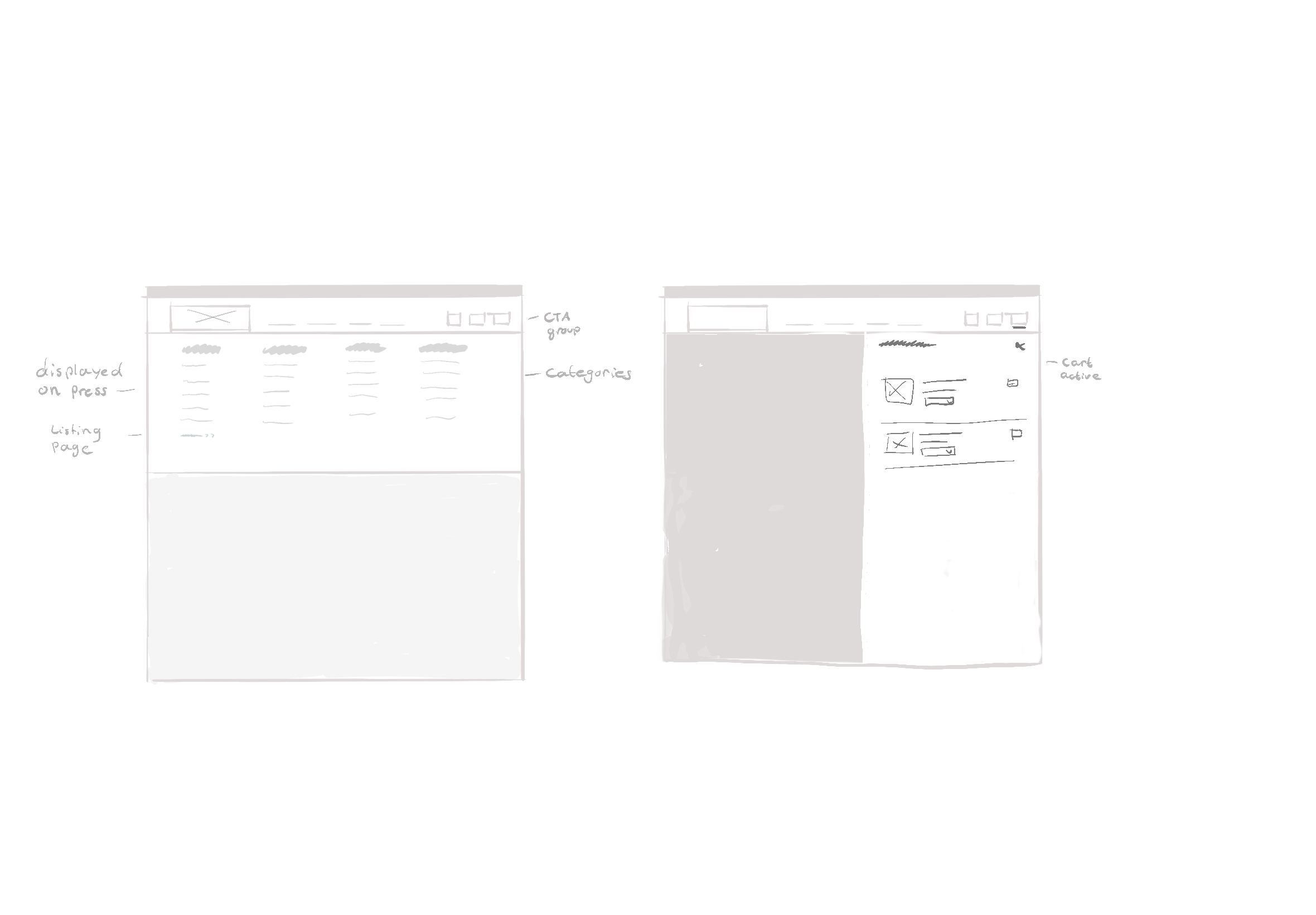
Image of initial sketches
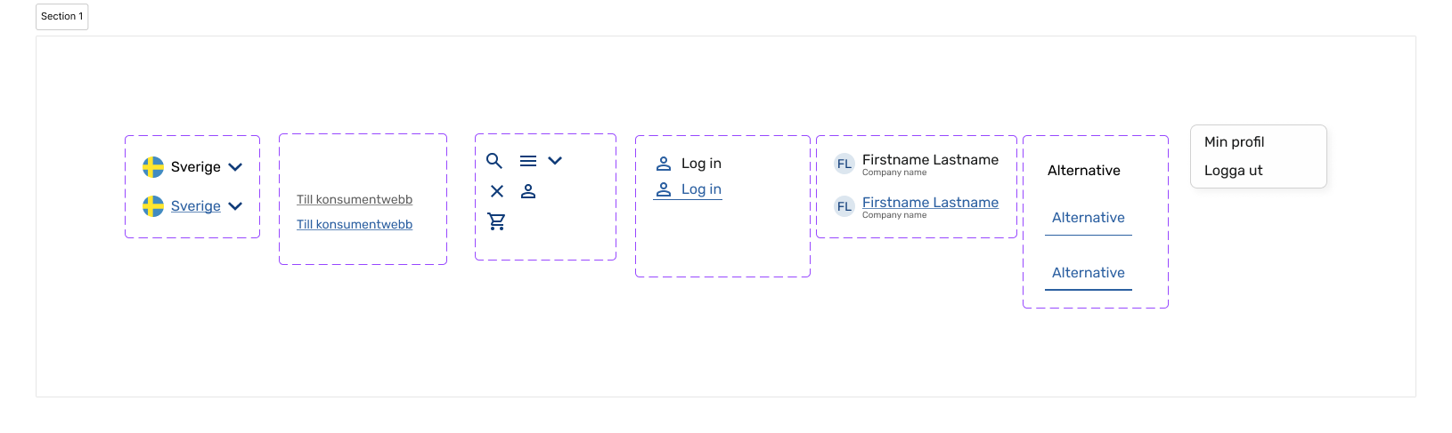
Image of components from Figma sketch
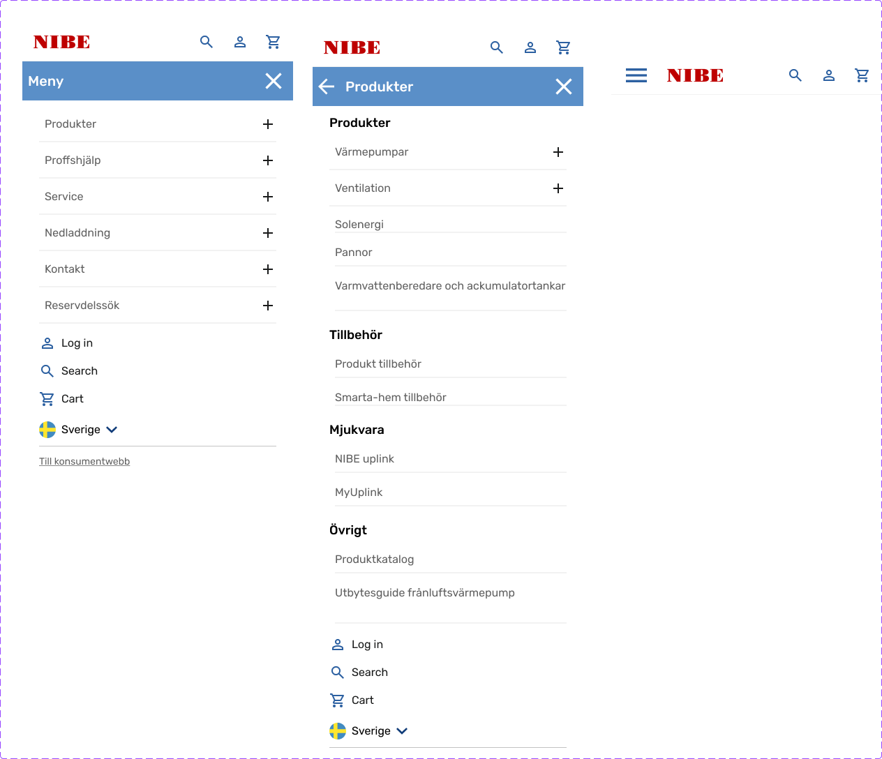
Image of hamburger menu wireframe in Figma
Testing and Validation: From Vision to Reality
No journey is complete without validation. The updated designs were tested with internal users and stakeholders across five markets to ensure the changes met diverse needs. Key improvements included:
- Accessibility: Keyboard navigation now worked seamlessly, and the tab order followed a logical flow.
- Responsiveness: The new menu scaled gracefully across devices, resolving issues on smaller laptops and mobile screens.
- Hierarchy: A clearer structure allowed users to locate options quickly and confidently.
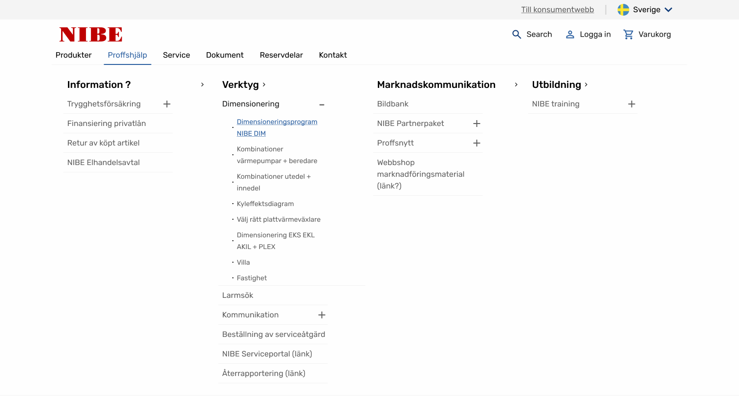
First iteration
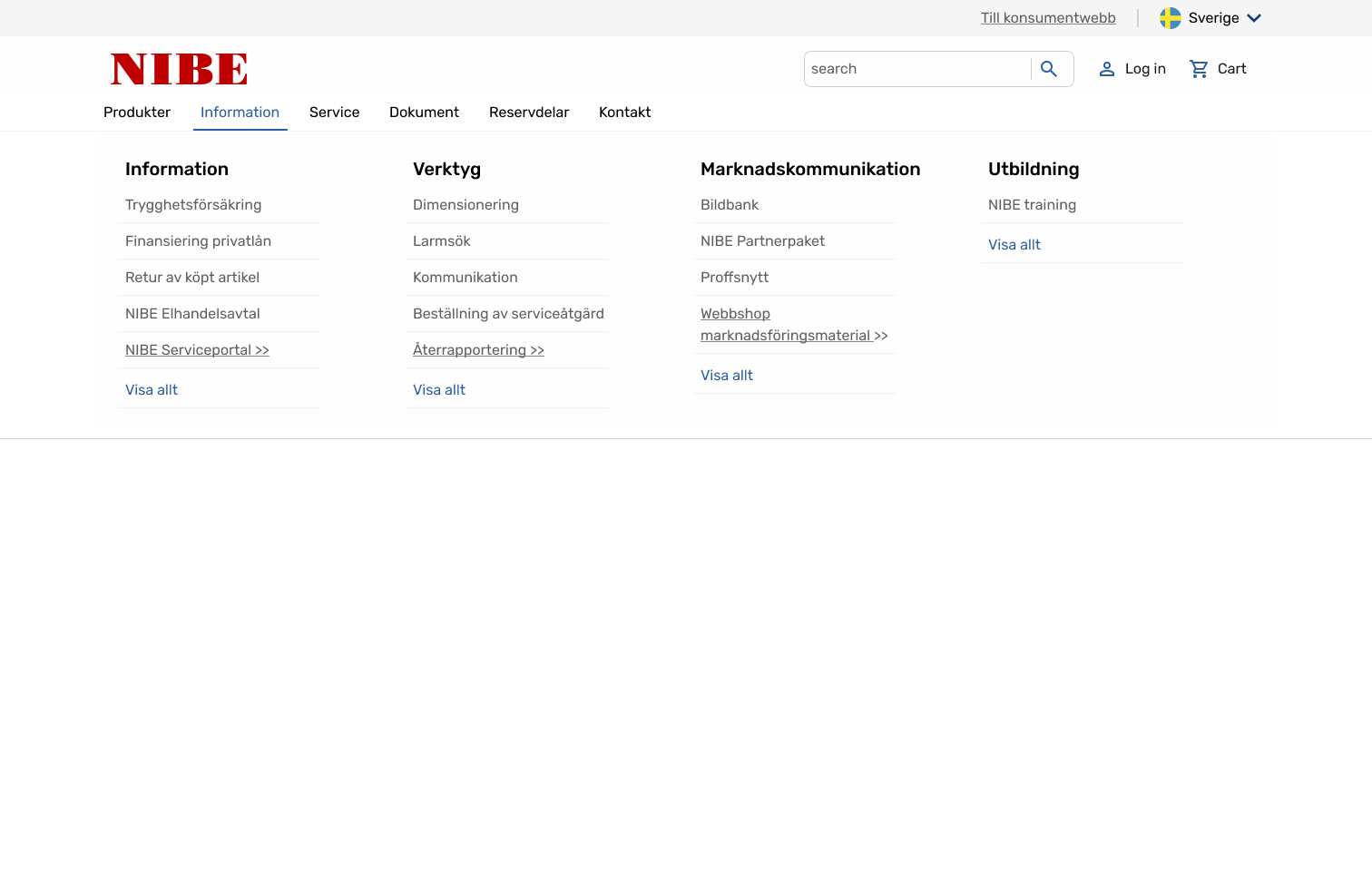
Last iteration without expandable options
Results: A Seamless Experience for All Users
The redesigned navigation system transformed how users interacted with the platform: The system became accessible, offering an inclusive experience for all users. Responsiveness ensured consistency across devices, from desktops to mobile phones. A streamlined structure simplified navigation, reducing confusion and improving usability.
- The system became accessible, offering an inclusive experience for all users.
- Responsiveness ensured consistency across devices, from desktops to mobile phones.
- A streamlined structure simplified navigation, reducing confusion and improving usability.

Lessons learned: The Power of Collaboration
This project reaffirmed an important truth: accessibility is a team effort. Close collaboration with developers ensured that design solutions were implemented correctly, from keyboard navigation to tab order. It also highlighted the value of iterative testing—early and frequent feedback allowed us to refine solutions and address stakeholder needs effectively. Ultimately, this journey was not just about creating a better menu—it was about fostering a culture of inclusivity and innovation.